

A single lab value tells you where you are. A pair tells you where you are going.
Context Health is a method for reading blood work. It treats a panel as a set of relationships rather than a list of values, and it reads those relationships against a reference set of real people rather than against a range built from a sick population.
Twelve years, over a hundred clients, nearly nine thousand scatter plots. This page explains what the method is, how it is applied, and where it stops.
What is wrong with the standard reading
A conventional panel is read one line at a time. Each value is compared to a reference range, flagged if it falls outside, and passed over if it does not. That is the entire assessment.
Three things are wrong with it, and none of them are the fault of the doctor doing the reading.
The range is built from the wrong people. Laboratory reference intervals are derived from the population that visits laboratories. That population is not healthy. Sitting inside a range assembled from unwell people is a weak claim about your health, not a strong one.
One marker at a time discards the information. Fasting glucose of 92 is unremarkable. Fasting glucose of 92 held in place by an insulin of 24 is a finding. The number did not change. What changed is what you compared it to.
The system does not pay for the reading. There is no insurance code for spending an hour looking at how someone’s markers move against each other, and the visit is ten minutes long. Most doctors are doing careful work inside a structure that will not fund analysis. The cost of that is paid by the patient.
What the method does instead
1. Run enough of the picture to have a picture
Blood chemistry in depth, intracellular micronutrients, a full hormone map, and genomic variants. Several hundred data points rather than the twenty a standard physical returns. You cannot find a pattern in four numbers.
2. Read the pairs
Triglycerides against HDL. Homocysteine against B12 and folate. Insulin against glucose. Uric acid against fructose intake and kidney clearance. The signal lives in what moves together, and in what stops moving together.
3. Plot against real people, split by metabolic state
Every pair is plotted across a de-identified reference set built from past clients, divided into insulin resistant and not. Where you sit, and which direction you are travelling, is more useful than whether a value cleared a threshold.
4. Put the diet data next to it
At least four weeks of logged intake, and continuous glucose data where it is available. Without it, results can be described but not explained. With it, the question stops being what your numbers are and becomes what is producing them.
Nothing here is exotic
Fasting insulin. Fasting glucose. Triglycerides. HDL. Homocysteine, B12, folate, uric acid, ferritin. Every one of these is a standard assay that any laboratory in the country runs, most for a few dollars, many without a prescription in states that allow direct access testing.
The method does not depend on a proprietary panel or a test only I can order. It depends on running enough of them at once, and on what is done with them afterwards.
That is a deliberate design choice and it cuts both ways. It means the cost of entry is a blood draw rather than a technology. It also means anyone can check my work, which is as it should be. If a finding only holds when read through a test nobody else can obtain, it is not a finding.
The scarce thing is not the data. Most people reading this have had several of these markers measured already, sitting in a portal, read once, and never compared to each other. The scarce thing is the hour spent asking what they say together.
Why the group you are in changes the answer
Two markers on your panel can move together in the population and in opposite directions inside it. Not weaker. Opposite. It happens in my own client data, in markers every lab runs, and it is the reason a value read against a population range can be read backwards.
The statisticians call it Simpson’s paradox. Here it is in 67 of my clients, split by whether they are insulin resistant. Glucose runs along the bottom of both panels:
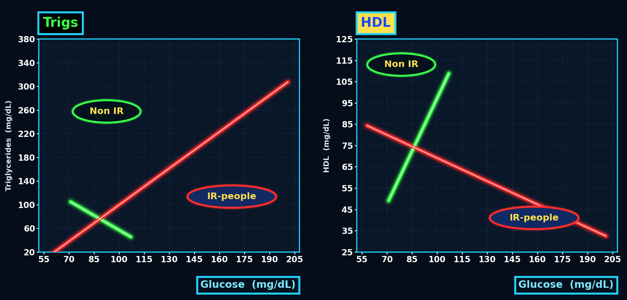
Glucose and triglycerides, the left panel. The red line is the insulin resistant. As fasting glucose rises, triglycerides climb with it, which is the reading everybody expects. The green line is everyone else, and it runs the other way. In that group higher fasting glucose travels with lower triglycerides. The two lines cross at about 85.
Glucose and HDL, the right panel. Same shape, mirrored. Among the insulin resistant, HDL falls away as glucose rises. Among those who are not, it climbs steeply. Same two markers, same blood draw, opposite direction.
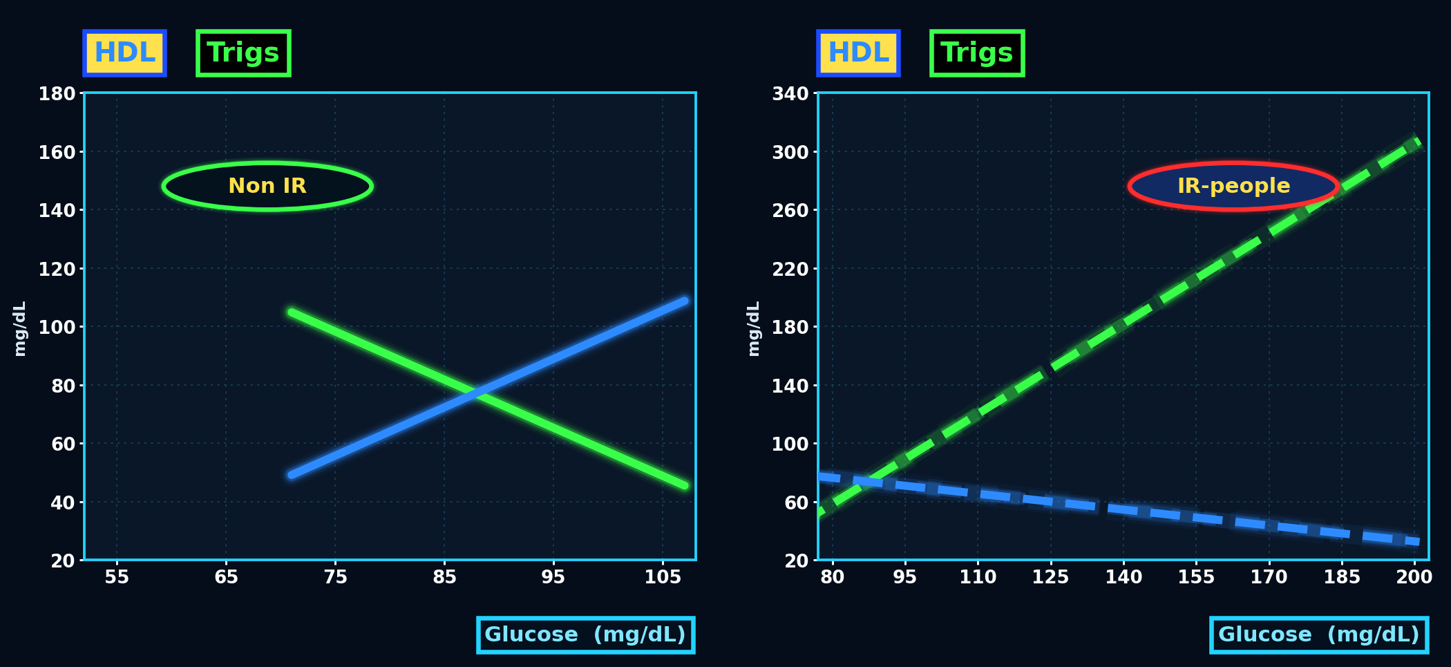
The same two markers again, this time with each group given its own panel and its own glucose range. Solid lines are the people who are not insulin resistant, dashed are those who are. Note the ranges: the non-resistant group lives almost entirely between 70 and 107, while the resistant group runs past 200. The vertical scales differ between the panels for that reason, so read each panel’s direction, not the steepness of one against the other.
The aggregate line in both charts describes neither group correctly, because it is an average of two opposite behaviours. It is not a compromise between them. It is a number that belongs to nobody in the room.
I checked whether my cutoff was doing the work, because that is the obvious objection. Move the line from a HOMA-IR of 1.4 to the conventional 2.0 and both reversals hold, in the same directions, at close to the same strength. The threshold is not manufacturing the effect.
This is the argument for the whole method in one image. Reading a value against a population range assumes you belong to that population. Before a marker can be interpreted, you have to know which group you are in, and that is a question no single value can answer.
Honest limits on this example: 67 people from one practice, 29 in one group and 27 in the other, straight-line fits, split at a HOMA-IR of 1.4. That is enough to demonstrate the phenomenon and not enough to establish a population claim. It is offered as a reason to stop reading markers in isolation, not as an epidemiological finding.

One turtle is a question. Three pointing the same way is a finding.
A value that lands somewhere it has no business being did not get there by itself. One marker out of place is worth asking about. Three of them pointing the same direction is something you can act on. That distinction, between a curiosity and a finding, is most of the discipline.
Where the method stops
A method that cannot say what it does not do is a sales pitch. Four limits, stated plainly.
Relationships are not always what they appear. HOMA-IR is calculated from insulin and glucose. Plotting glucose against HOMA-IR therefore plots glucose against itself, in part, and any relationship it shows is inflated by the arithmetic. I have caught this in my own charts. Every pair has to be checked for that kind of circularity before it is trusted.
A curve fitted to few points will tell you whatever you want. Zoom in far enough on a narrow range and a polynomial will invent motion that is not there. I have drawn one myself: a fitted curve on a healthy group that ran downhill so convincingly it put the group average glucose at 58 mg/dL. No group of metabolically healthy people averages 58. The curve was not describing them, it was describing the end of its own range. Two tests keep this honest. Does the shape survive when you drop a third of the group at random and refit, and are the endpoints values a human being could actually produce. A shape that fails either one is a question, not a finding.
Units and data entry break more findings than biology does. A convincing relationship in my own dataset turned out to be an artifact of the same measurement recorded two different ways. The dataset gets audited before it gets interpreted.
This is analysis, not emergency medicine. Context Health is a way of reading data to understand a trajectory and change it. It does not replace acute care, diagnosis, or a relationship with a physician, and it is not intended to.
Stated positions
Where the method departs from convention, it says so rather than hiding it.
A HOMA-IR cutoff of 1.4 is used, against a conventional 2.0 to 2.5. That is deliberate. By the time the standard threshold is crossed, the process has been running for years and the window in which diet alone reliably reverses it has narrowed. The earlier line catches people while the answer is still a change in what they eat.
Who developed it
Karl Goldkamp is a naturopathic doctor, a graduate of Bastyr University, and the author of Unlocking Optimal Metabolic Health and Precision PSMF. He built the method over twelve years of clinical practice, partly out of necessity: he learned to read data this way while trying to understand his own collapse, having nearly died of ulcerative colitis and Crohn’s disease in 2012 with a set of results nobody was reading in relation to each other.
Reading this is not the same as having it done
Context Health is a method, not a product. It is applied one to one, on your own panels, by the person who built it. What you have just read is how the reading works. What it finds in your case depends entirely on what your numbers do against each other.
You can keep reading your results one line at a time against a range built from a sick population. Or you can have them read as a set. The labs are the same either way.
Or start with a free 20-minute call. No cost, no obligation, and I will tell you on the call if this is not a fit.
Follow Me


Recent Posts
Archives
- September 2026
- August 2026
- July 2026
- June 2026
- May 2026
- April 2026
- March 2026
- February 2026
- January 2026
- December 2025
- November 2025
- October 2025
- September 2025
- August 2025
- July 2025
- June 2025
- May 2025
- April 2025
- March 2025
- February 2025
- January 2025
- December 2024
- November 2024
- October 2024
- September 2024
- August 2024
- July 2024
- June 2024
- May 2024
- April 2024
- March 2024
- February 2024
- January 2024
- December 2023
- November 2023
- October 2023
- September 2023
- August 2023
- July 2023
- June 2023
- May 2023
- April 2023
- March 2023
- February 2023
- January 2023
- December 2022
- November 2022
- October 2022
- September 2022
- August 2022
- July 2022
- June 2022
- May 2022
- April 2022
- March 2022
- February 2022
- January 2022
- December 2021
- November 2021
- October 2021
- September 2021
- August 2021
- July 2021
- June 2021
- May 2021
- April 2021
- March 2021
- February 2021
- January 2021
- December 2020
- November 2020
- October 2020
- September 2020
- August 2020
- July 2020
- June 2020
- May 2020
- April 2020
- March 2020
- February 2020
- January 2020
- December 2019
- November 2019
- October 2019
- September 2019
- August 2019
- July 2019
- June 2019
- May 2019
- April 2019
- March 2019
- February 2019
- January 2019
- December 2018
- November 2018
- October 2018
- September 2018
- August 2018
- July 2018
- June 2018
- May 2018
- April 2018
- March 2018